The Unseen Path to Success
Coupon Accessibility
Redesigned the voucher and gift card checkout flow by introducing a selection-based UI and simplified management, leading to a 4% increase in Conversion Rate (CR) for users with discount codes.
OVERVIEW
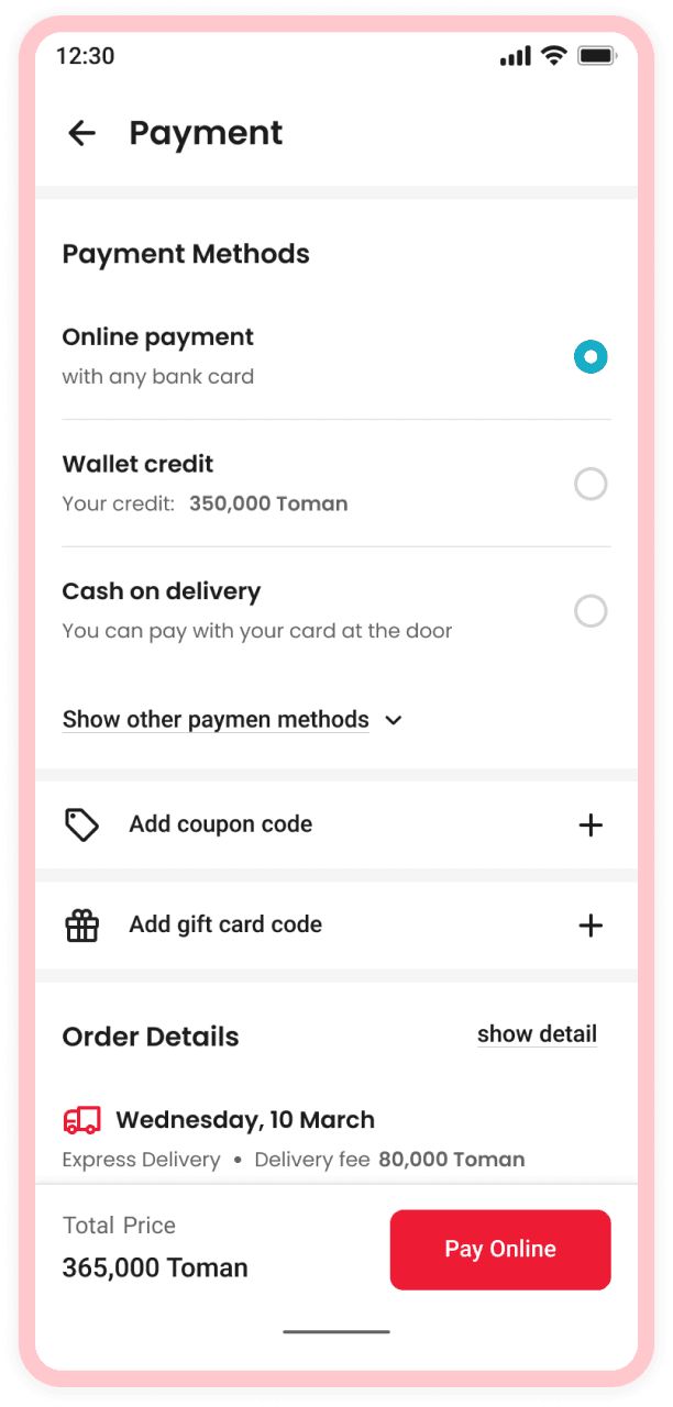
Coupon codes on Digikala help users save money and increase their likelihood of completing a purchase. With this in mind, we built a new experience that allows users to easily input, select, and delete voucher codes during checkout. Blindly following industry benchmarks can be counterproductive. Each business needs a tailored approach based on user needs and goals.
MY ROLE
Product Designer - wireframing, prototyping, user flows, product design
OUR TEAM
1 Designer, 2 Product Managers, 7 Engineers, 1 Design Researcher
Defining the problem
According to the CRM team, reports 10% of user calls were related to voucher code troubles, and these problems included:
- The challenge of deleting messages related to voucher codes that have been sent to them,
- The difficulty of applying the relevant code correctly to the voucher code field (input box).
Also, each business's main goal is to increase its conversion rate, and our payment step did not contribute to this goal. According to team researcher surveys, 11.4% of the reasons for churn at the payment stage were due to the problem with the discount code, and 2.9% were related to the gift card section (its flow is entirely similar to voucher codes).
🗣️ I engaged with local teams to learn from their expertise,
📊 analyzed CRM dashboards for data insights,
📄 Analyzed the survey documents conducted by our researcher.
Data related to design research for payment churn reasons shows us that 11.4% of the reasons are for the voucher section problem!
Here you can see data related to design research:
Going Deep Into Problems
Here, I wanted to understand deeply why our users get into trouble with the voucher section, so I asked our researcher to set up an interview to have a deep insight into what problems users really face while using their own voucher codes or campaign codes.
Interviews
The interview was conducted, and users were asked to navigate through the checkout process and enter the voucher code which has been given to them. The primary objective was to determine if they could:
🍄 Enter their voucher codes successfully
🍄 Cancel the applied code from the input
🍄 Understand how much discount they’ve got
“I’m confused; I don’t understand how to cancel the applied code. I’m gonna try going back and then returning to the payment step.”
”I'm trying to redeem my voucher code, but I'm not sure if it's been applied.”
”I cannot figure out whether the bill box discount is related to my code or just for the products.”
BREAKDOWN OF PROBLEM
⌨️ Users have some mistakes in writing the voucher codes
Many users had trouble reading voucher codes in SMS messages and pasting them into the input box.
🗑 They can not cancel an applied voucher code
This was ultimately a flow issue: the applied code would be cleared if the user refreshed the page or navigated back from the payment step.
🖍 Inline instructions writing mistake
The inline instruction shown after applying a discount code is slightly ambiguous, which confuses users.
🧾 Displaying different discounts in the same area in the bill box
Only a single line in the bill box shows the total discount applied, so users can’t tell how much comes from their voucher code.
Problem Statement
Users are not given enough information about voucher codes (discount amount, termination date, usage, etc.) in the current voucher code field; they have to enter the code multiple times, the inline instructions provided after applying the code are not very detailed, and it is difficult to delete the code. How might we reduce user anxieties during moments of failure and give them a clear way ahead?
💡 Brainstorming and wireframing
My work included exploring different ideas, creating wireframes and user flows, and going through rounds of design reviews and critiques.
Finalizing design and design reasons
My work included exploring different ideas, creating wireframes and user flows, and going through rounds of design reviews and critiques. During the design process, I encountered several instances where I was required to make a decision.
THIS OR THAT?
👁 Keeping the voucher section open or collapsed
Since our target users were customers who had difficulty entering voucher codes or who lost them, we decided to keep the voucher code section collapsed by default so as not to affect the group of users who did not want to use vouchers at their payment step. Additionally, we can see if these customers who had problems with vouchers were satisfied with our solution at the first step.
⬆️ Keeping input on top of the section or at the bottom
While the most important aspect of the voucher section is to display users their assigned vouchers, we observed that users in the gift card section demonstrated less interaction with the input field when it was placed at the bottom of the section. Therefore, I decided to place the input field at the top of the page so that users can see the selected codes being applied to the input field, which allows them to recognize the changes and erase and terminate the code using the cancel icon on the left side if they change their mind.
Outcomes
Lessons
In all the benchmarks I have done and read on Baymard and the many articles that have been written about the voucher code section, they all strongly emphasize that putting the discount code field in the view decreases conversion rates. , but it seems that a user who has a discount code may lose his motivation when he can't use his discount code, so why should I hide this section when he has come to the payment page with this motivation?
Next case study
SnappMarket, Conversion Rate Optimization